Everyone here at the office really likes the HBO series "Game of Thrones", so we decided our next art blog post would be of artwork based around that series. I've been wanting to get into more environment type of digital paintings for awhile now, so I saw this as a great opportunity to start.
I found a good reference shot of "the wall" online from the official GoT site and thought I'd just do something similar. I then proceeded to watch some environment painting training videos done by Dylon Cole and man did he ever make it look easy. This should be a breeze, right? Noooope. What I found was a new respect for all those guys and gals out there that make this look so easy, hats off to you folks.
Made mistakes, learned many things, had lots of fun and came up with this...
Monday, February 27, 2012
Thursday, December 22, 2011
Orcs Must Die!
By far "Orcs Must Die!" was the most fun I've ever had working on a game. If you've never seen or played this game, I'd highly recommend checking it out! It can be purchased on Steam or through Microsoft XBLA on the 360. I can still remember the feelings of our first play-test was nothing but a non-stop adrenalin rush! Anyway I just wanted to get some artwork posted from the game. I started out creating basic level building assets and then slowly transitioned into level building and lighting. The level building stuff was really fun because we had total artistic freedom on what the levels would look like, we just had to be careful not to fill too much of the walls and ceilings with art that traps couldn't be placed on. Anyway you probably didn't come here to read, but to look at some cool imagery, here ya go!
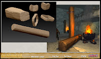
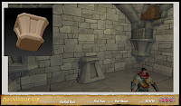
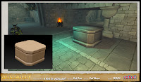
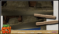
Assets:
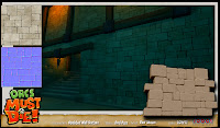
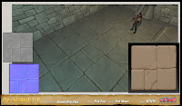
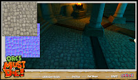
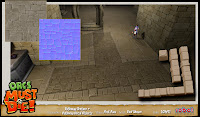
Decals are a wonderful thing, they work great with floor trap placement.
Oh yeah, the front door was supposed to have chains!
Rift base without particles
This actually got cut for design reason:
1st pass
2nd Pass - cleaned up the crystal and possible color variations
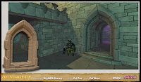
Screenshot from some of my Levels:
The Squeeze
Lunch Break
Hard Climb
The Baths
Level never made game :(
Lunch Break
ChokePoint
Triple Down - the quad Ballista here never made it into the game
Thank you for visiting and please don't hesitate to ask any questions.
Paul
Assets:
Decals are a wonderful thing, they work great with floor trap placement.
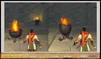
Oh yeah, the front door was supposed to have chains!
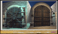
Rift base without particles
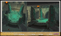
This actually got cut for design reason:
1st pass
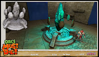
2nd Pass - cleaned up the crystal and possible color variations
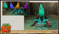
Screenshot from some of my Levels:
The Squeeze
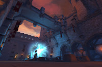
Lunch Break
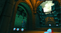
Hard Climb
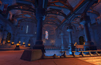
The Baths
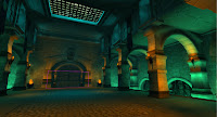
Level never made game :(
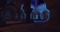
Lunch Break
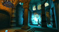
ChokePoint
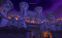
Triple Down - the quad Ballista here never made it into the game
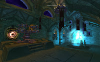
Thank you for visiting and please don't hesitate to ask any questions.
Paul
What year is it...?
Yeah, it's been awhile since my last post, life has been crazy ever since I joined Robot Entertainment and I have definitely neglected my blog. When I first joined RE, we had a contract to produce the next "Age" game and I wanted to just post some of my work from that title. I worked mainly on buildings, terrain and UI mockups:
Some Buildings:
Now for some terrain images:
And other miscellaneous stuff:
UI mockup:
Unit Selection Mockups:
Unit Hitpointbar mockups:
Think that's enough for "Age" and thank you for checking out my blog. My next post will be of all my "Orcs Must Die!" artwork so check back :)
Later...
Some Buildings:
Now for some terrain images:
And other miscellaneous stuff:
UI mockup:
Unit Selection Mockups:
Unit Hitpointbar mockups:
Think that's enough for "Age" and thank you for checking out my blog. My next post will be of all my "Orcs Must Die!" artwork so check back :)
Later...
Saturday, August 8, 2009
Another Unused asset...
Monday, December 1, 2008
Rocked...
So, I threatened to do a rock after my tree and it turns out it looks just like a rock I'd done awhile back. I guess once you have it in your head what you think a rock should look like, that's the rock your going to make everytime. I modeled the bottom to be more flat and layered, that way I could get use the same rock and get different looks by just rotating it around. Here are some renders.
.
.
Friday, October 3, 2008
Zbrush time
Ok, so my current task for HaloWars is to create a dead tree. I've done several of the trees in the game, so I have a pretty good feel for what it takes to make a tree look good from game view (small textures, low poly count, and alphatest). I wouldn't normally us Zbrush for any small RTS type object because you lose all the cool detail Zbrush gives you when you have to crunch the textures down, but I need to start using it more so I'm going to be less productive than normal. I first had to watch all the tutorial videos from the web because all the teachings of Paul Warzecha had somehow managed to fall out of my brain. After watching those I got to it. Here is my model I imported in from Max with UV's already layed out. Added several SubDivision levels and got to sculpting. Zbrush is really cool and the hardest part about using it (besides the ui), is trying not to put too much detail all over the place. Anyway here is what I ended up with. After importing this object into Max to create my normal map (ZMapper=not nice) and working up the diffuse and spec textures, it actually turned out ok. Oh btw, I used alpha'd poly's to create all the branches in case you were wondering :) Sorry, but I'll post some images of the finished tree once the game ships.
Felt good to use Zbrush again and I'm itching to do more now. How about some rocks!
Wednesday, October 1, 2008
Age of...biggest game ever...so we thought
Not many people were real excited about the time frame of AoE3, but the artists were excited to hear we wanted to make the best looking game possible and not be restrained by the nature of the RTS. With that in mind most of our poly counts tripled from what we had been doing for AoM (now that I look back, I think we tried to go too low on AoM). Age3 was a content monster and ES was hiring as many folks as we could. It's amazing the amount of talented people we could find that actually wanted to work on this game and for this company. We separated the art leads up into different areas of responsibility and I was in charge of the random maps, buildings, homecities, and eventually a thing called Grand Conquest, but it got cut due to time constraints. I originally made that parchment paper looking map for the grand conquest screens, but luckily it wasn't wasted (I spent a month work on that thing). Turns out that was the one piece of my art that got plastered all over the UI and webpage, so that was really cool.
Mock-up images. This early homecity image changed the way the game looked completely. It was the testing ground for all the new shaders that made Age3 look the way it does. Huge kudos to Scott Winsett and Rich Geldriech for all the heavy lifting in that area. Other mock ups include a train, that I worked on for a company intro movie; early towncenter line up; homecity shipment objects and building construction stages.
Mock-up movies. This hand animated barracks destruction mock up was our first attempt at in-game destruction. We used Havoc in the end, but this was kind of where it all started. The stream mock-up was an idea I had using the same tech that created the trade routes. It's a mix of 3D objects, decals, and particles.
Here are some building textures from Age3. I always like showing my textures since that is where I spend most of my time working. I'm not going to post any normal or spec maps from Age3 because they were just black and white CrazyBump creations based off the diffuse texture.
Subscribe to:
Posts (Atom)